Case study 01
Atlas Pay
A payments brand built from a single mark, drawn flat, milled into a chip, lit in 3D and carried into the product.
- Sector
- Cross-border payments
- Year
- 2026
- Role
- Identity · Chip · 3D · Product
- Scope
- Mark to app, one designer
Overview
A brand for businesses that move money across borders, with one account, cards for the whole team and every payment visible the moment it happens.
Deliverables
Mark, chip, card, 3D films, app and web
Typeface
Aeonik by CoType Foundry
The challenge
Challenge
One identity that holds up flat on a screen, milled into metal and lit in 3D, without changing its shape.
A payments brand for businesses that move money across borders. The brief’s four words became the test every decision had to pass.
- Global
- Built for money that crosses borders.
One system that reads the same in every market. - Intelligent
- Precise, calm, considered. The product
does the heavy lifting, not the decoration. - Trustworthy
- High contrast and nothing hidden.
Every number readable at a glance. - Premium
- Materials over ornament:
metal, light and a lot of black.
01 / Process
Process
It started with Atlas, the Titan who holds the world on his shoulders.
The first marks took that literally, with strokes bracing, carrying and leaning into a circle. A lot of shapes later, the strokes stopped holding the world and became it.
- Bearing
- Carrying
- Leaning
- Bracing
Columns
Atlas as support. It never translated into a real idea, just another generic “connecting people worldwide” mark.
Network
It read like a tech start-up rather than a finance brand, with the generic “connecting people worldwide” look.
- Rays appear
- Rays, contained
- Rays from a corner
- One origin, every direction
02 / Mark to chip
The idea
Every card has a chip.
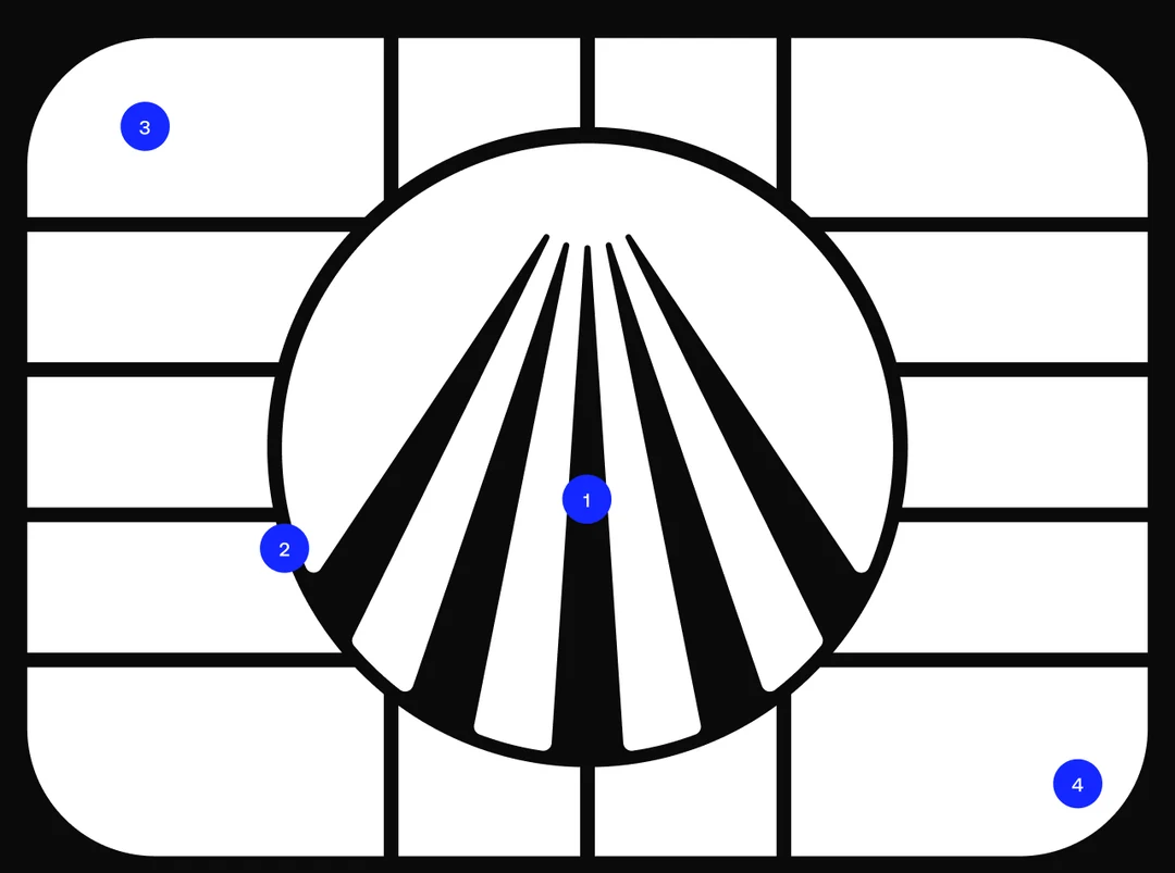
Ours carries the mark.
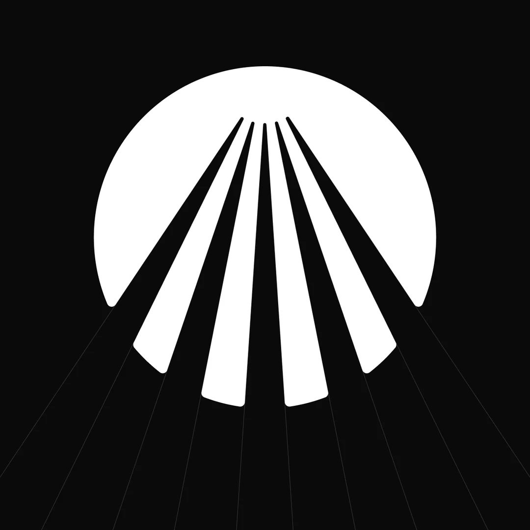
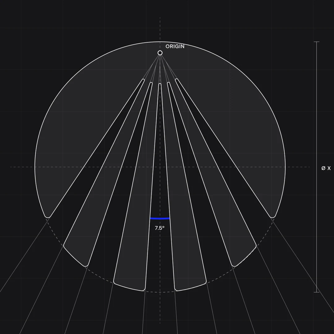
Rays from a single origin, held inside a circle, then milled into the contact grid. The mark sits in negative space where every card already has a chip.
- Origin
- 0.044 x below the top edge
- Angle
- 7.5° steps, ten edges, five cut-outs
- Chip
- Mark in negative space, pads redrawn around it
03 / System
System
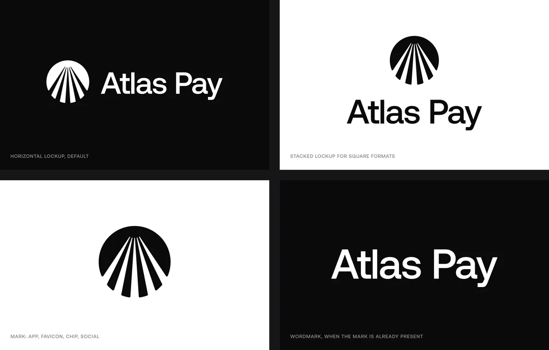
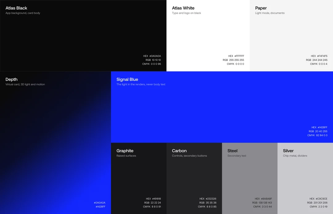
Black and white do the work.
Blue behaves like light.
Greys support and one blue is kept for light, with every value taken from the product itself. Aeonik carries everything from balances to headlines.
04 / Card & 3D
Card & 3D
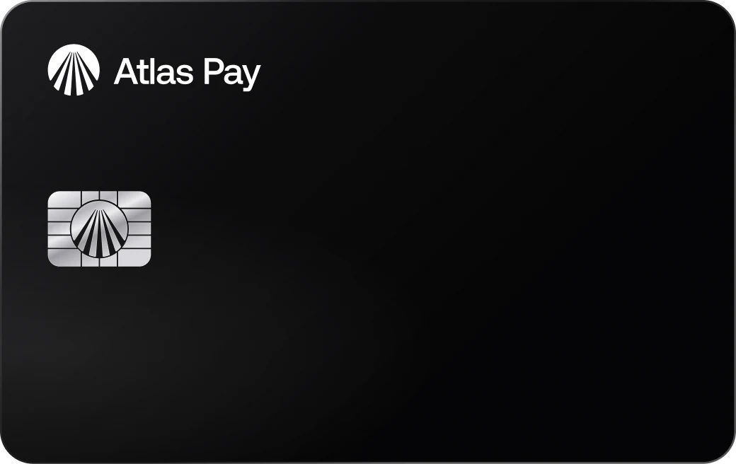
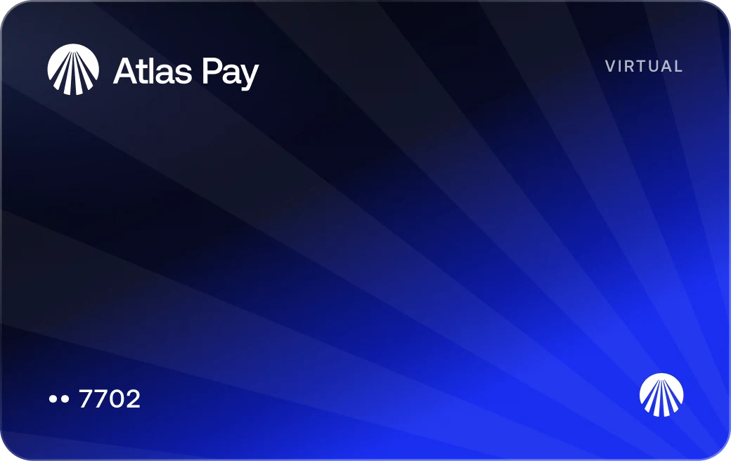
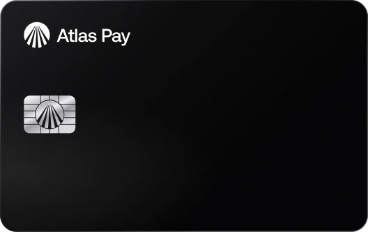
A metal card in black, and a virtual one that only lives in the app.
Signal Blue only becomes a surface on the virtual card, as the Depth gradient crossed by the ray grid. The 3D films push the metal card through the same light the brand is built on.
- Material
- Stainless steel, ~18 g (proposed)
- Chip
- Custom, with the mark in the contact grid
- Virtual
- Unlimited, per person or per supplier
05 / Product
Product
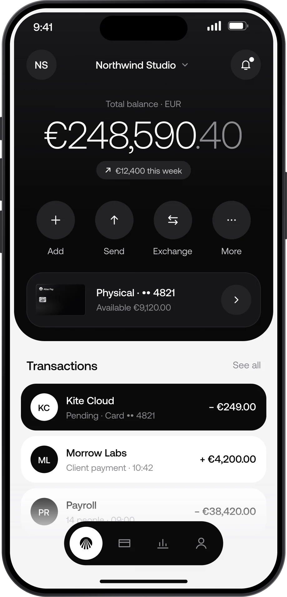
In the app, the numbers come first.
The card’s contrast carries into everyday use: a black balance panel, amounts in Aeonik Light with the cents stepped back, flat buttons and one floating bar. No glass and no gradients on controls.
The material lives on the card.
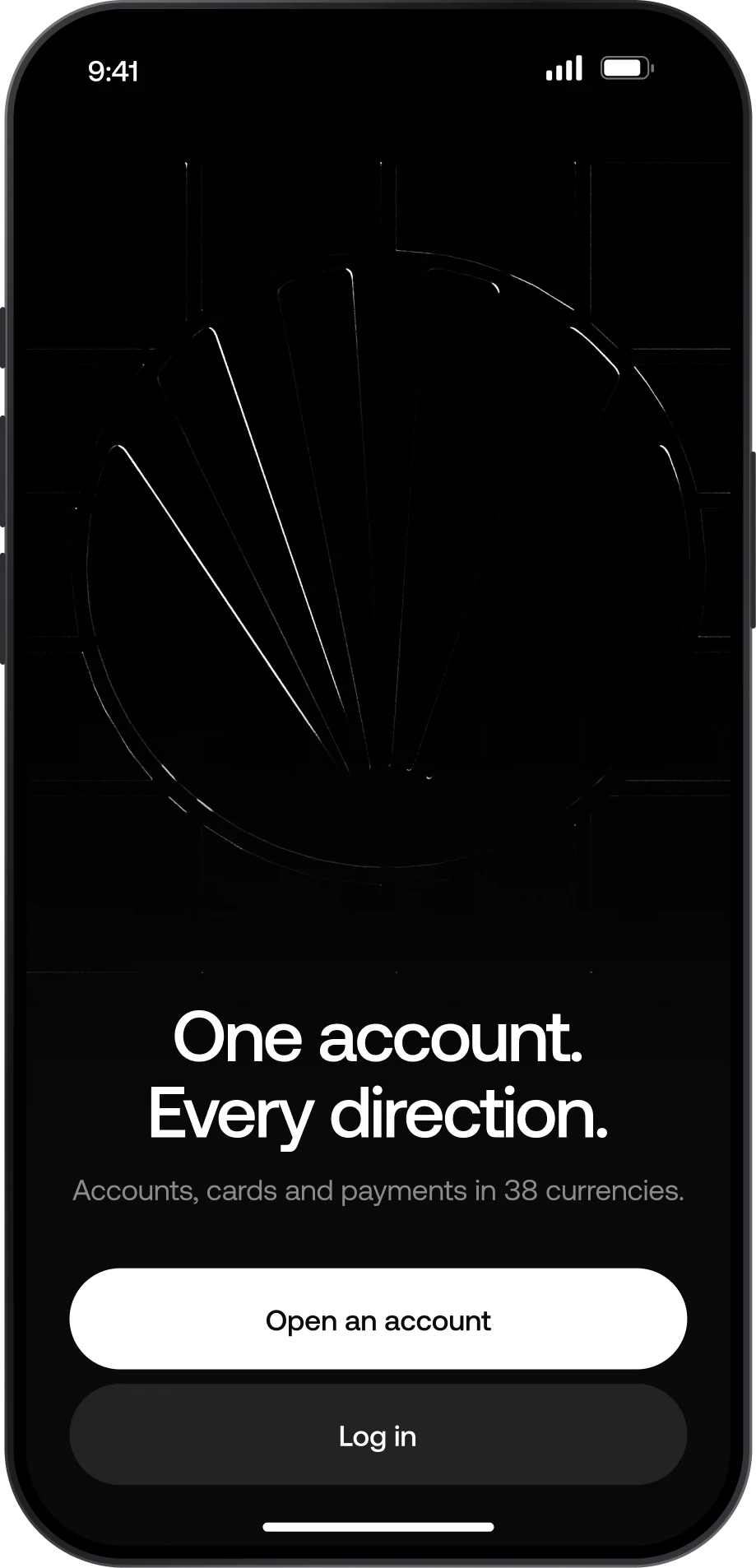
01 / Welcome
The 3D film sets the tone before sign-up.
02 / Home
Balance first, four actions, today’s activity.
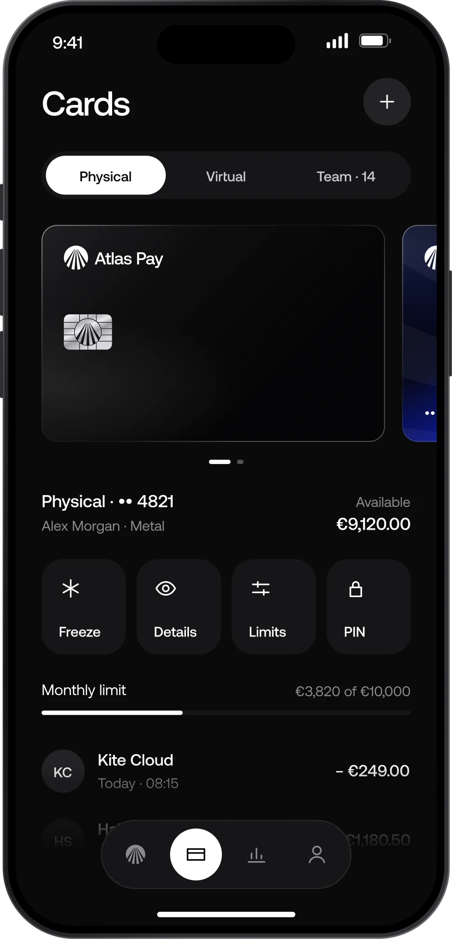
03 / Cards
Freeze, details, limits and PIN one tap away.
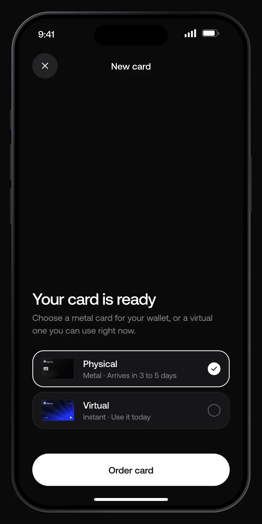
Ordering a card
Ordering a card ends with it sliding out of its sleeve.
Instead of a confirmation screen, the card slides out under the same light as the 3D films, then the details settle underneath.
Payments
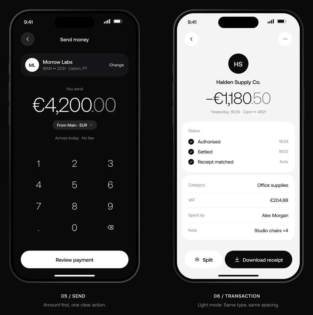
Every payment shows where it is.
Authorised, settled, receipt: a short timeline under the amount, which stays the loudest thing on screen. The same system switches to Paper for daylight and documents.
06 / In the world
In the world
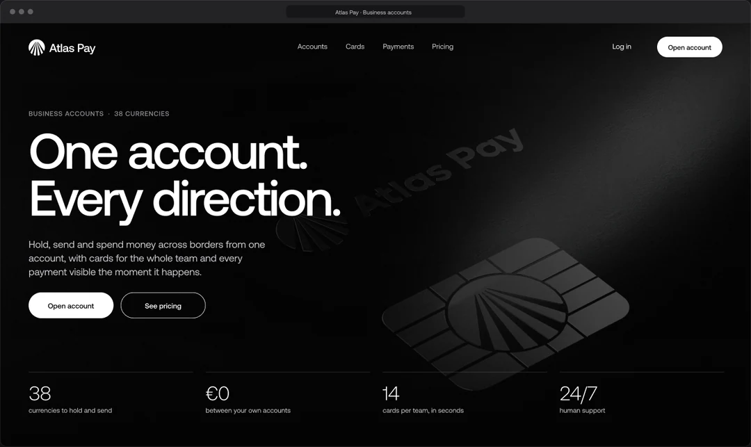
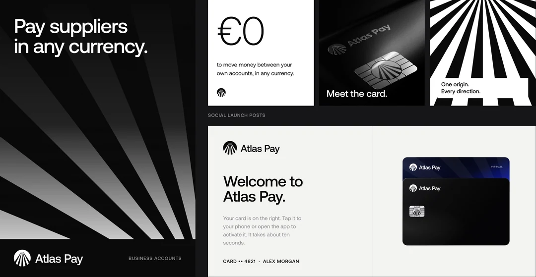
The ray grid carries the mark onto every surface.
Website, out-of-home, social and the welcome letter that would ship with every card, all cut from the same 7.5° grid.
Credits
Credits
Mark, chip, 3D and product.
One designer, start to finish.
- Design
- Angel Guleran
- Year
- 2026
- Tools
- Figma · Illustrator · Blender
- Typeface
- Aeonik, CoType Foundry
- Audience
- Businesses that trade across borders
Contact
- Based in Romania
- Behance (opens in a new tab)
- LinkedIn (opens in a new tab)
- Back to top